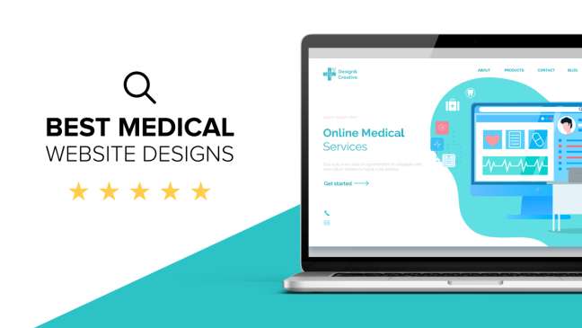
In healthcare website design, a primary goal is to connect with the viewer emotionally. This means conveying the most important message to them instantly. This is particularly important for homepages, as most patients will scan the homepage, picking up appealing subheadings, keywords, and images before clicking away. As a result, the most important content should be prominently featured and easily accessible at the top of the page. The content should be clear and easy to understand without the need to read it carefully or click.
HIPAA compliance
HIPAA compliance is an important aspect of healthcare website design. It requires that your website utilize a secure connection by securing all data transmitted through your site with an SSL certificate. This ensures that sensitive data can only be read by those who have authorized access to it. This also ensures that your data is protected from unauthorized access, reducing the risk of a cyber attack.
While HIPAA compliance isn’t necessary for all medical websites, it’s essential if you plan to handle sensitive patient data. This includes information such as e-PHI or electronic health information. Your healthcare website needs to be HIPAA-compliant if you want to maintain patient privacy.
Mobile responsive design
If you want your website to have the best visibility online, you need to consider mobile responsive healthcare website design. The majority of Internet users access websites from their mobile devices. Moreover, Google will use the mobile version of your site for indexing and ranking purposes. Without a responsive design, your website will fall behind your competitors.
A professional medical website design agency will build your website keeping the mobile user in mind. Mobile users are becoming more frequent internet users. This means your website should be fully optimized to work well on smartphones and tablets. An experienced web developer will start with the smallest screen and work up to larger ones. This will ensure that all call to action buttons function correctly. The designers will also minimize the graphics on your website so that it can be viewed on smaller screens.
Blue-on-white palette
Blue-on-white is a classic color combination for healthcare website design. While this color scheme is usually used to make websites look more professional, it can also be very inviting if it has warm tones. The Hunger Project homepage incorporates a dusty blue as its central color and uses other colors, such as teal, peach, and gold, to add warmth and comfort. Although this color scheme is traditionally used in healthcare website design, it can also be used in a more playful way, such as by using yellow or orange accents.
Green is another color that is often used in healthcare website design. This color has a calming effect on the eye, and is associated with well-being and prosperity. However, while green is not used for core medical websites, it is a common color for peripheral medical websites. The color is also soothing to the eye, and a soft shade of green on white can keep visitors on the page longer.
Sans Serif fonts
When choosing fonts for healthcare website design, it’s important to consider your target audience. For instance, if your practice is highly specialized, a modern, thin sans serif font would be a poor choice. In contrast, if your practice is more generic, you can opt for a more classic, elegant serif.
Healthcare websites use two primary types of fonts: serif and sans. It is recommended to use a combination of the two types of fonts on a healthcare website. You can also use a script font for decoration.
Easy to navigate
A healthcare website design should be simple to navigate and contain only a few main items. If you have more than that, it will seem cluttered and difficult to navigate. In addition, avoid avant-garde designs or odd page structures. Instead, keep your design simple and use plenty of white space to funnel your visitors to the information they need.
A healthcare website should also be easy to read and understand. If visitors can’t easily read the text, it will be hard to navigate. For instance, if they are color-blind, they will have difficulty seeing the text. Also, the font size is unfriendly to readers with normal vision.
